Token Dashboard
1. What is this screen for?
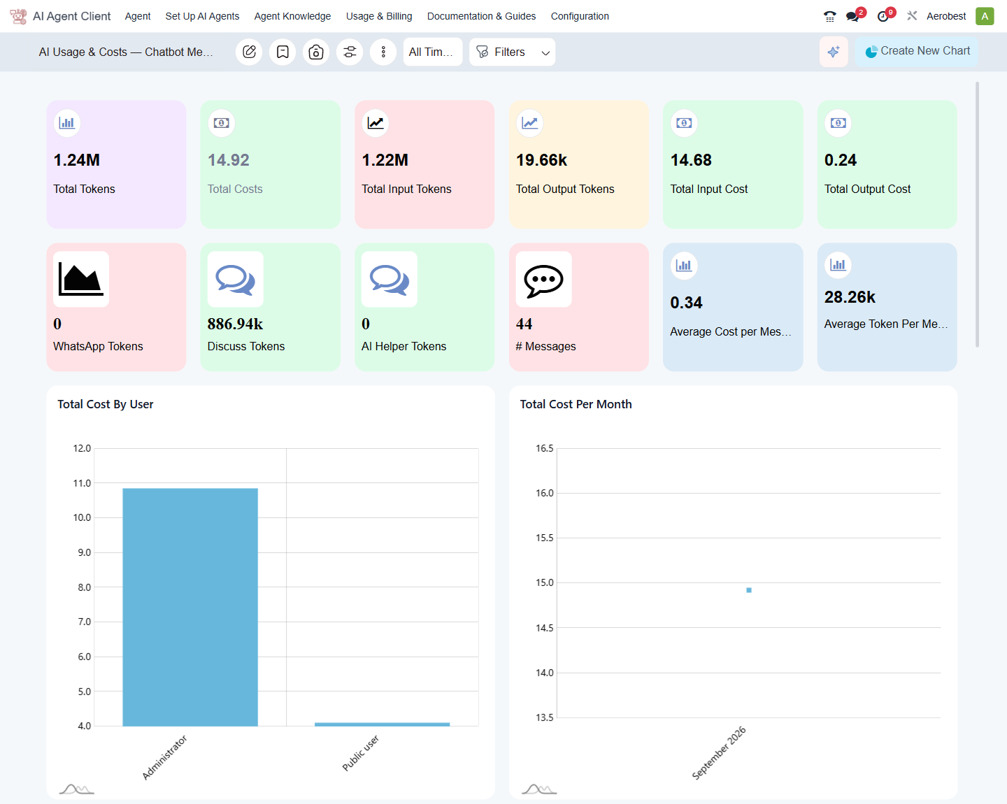
The Token Dashboard gives you a visual overview of your AI spending — how many tokens have been used, what they cost, which channels consumed the most, and how costs trend over time.
2. Who uses it?
Administrators at your organization.
3. What do you actually do here?
The dashboard is titled "AI Usage & Costs — Chatbot Message" and is built from tiles and charts. You can filter by time period using the All Time dropdown at the top, or click Filters to narrow by channel, user, or date range.
Summary tiles
The top rows show headline numbers at a glance:
Total Tokens — the total number of tokens consumed across all channels.
Total Costs — the total cost in Malaysian Ringgit.
Total Input Tokens — tokens used to send messages to the AI.
Total Output Tokens — tokens used by the AI to generate responses.
Total Input Cost — the cost of input tokens.
Total Output Cost — the cost of output tokens.
Below these, channel-specific tiles show token usage by source:
WhatsApp Tokens — tokens consumed by WhatsApp conversations.
Discuss Tokens — tokens consumed by Odoo Discuss conversations.
AI Helper Tokens — tokens consumed by the Odoo Helper.
# Messages — the total number of AI messages processed.
Live Chat has no tile of its own; its usage is included in the totals above.
Cost-efficiency tiles on the right show:
Average Cost per Message — the average cost per individual message.
Average Token Per Message — the average number of tokens each message uses.
Charts
Below the tiles are seven charts. The first two give you the visual trends:
Total Cost by User — a bar chart showing which users are consuming the most tokens, ranked by cost. Useful for identifying heavy users or spotting unexpected usage from public/anonymous users.
Total Cost per Month — a line chart showing how spending changes month to month. Use this to spot trends — rising costs may mean increased adoption (good) or runaway usage (worth investigating).
Further down: Input vs Output Cost by User, Total Tokens by User, Top 5 Tokens Usage per Conversation, Top 5 Cost per conversations, and Total Tokens Per Month.
Checking your usage and topping up
Use this dashboard to monitor whether your spending is on track. If costs are rising faster than expected, drill into the per-user chart to see where the usage is coming from. To check your remaining balance or top up, go to Usage & Billing → Wallet & Plan.
4. What do you do when it looks wrong or empty?
Dashboard is completely empty: No AI messages have been processed yet. This is normal for a freshly installed system. The dashboard populates as soon as users start interacting with agents.
Tiles and charts show zero: The time filter at the top may be set to a period with no activity; it applies to every tile and chart. Choose All Time to see everything.
A user shows unexpectedly high usage: Click on the user bar in the Total Cost by User chart to investigate. Cross-reference with the Messages screen (Usage & Billing → Messages) to see the actual conversations and their token costs.
Costs seem too high overall: Check the Average Token Per Message tile. If it is unusually high, your agents may be searching through very large document sets or handling complex multi-turn conversations. Review your agents' knowledge bases — smaller, more focused document sets produce more efficient answers.